grouper-dev - RE: [grouper-dev] Another stab at the left column
Subject: Grouper Developers Forum
List archive
- From: Gagné Sébastien <>
- To: "Michael Girgis" <>
- Cc: <>
- Subject: RE: [grouper-dev] Another stab at the left column
- Date: Wed, 19 Dec 2012 15:39:08 -0500
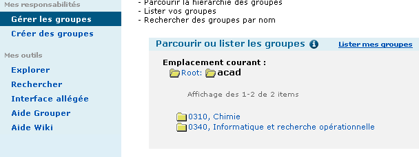
I know this is very focused on us, but here is our use case : We are managing course groups, we split them in departments to have multiple managers. This creates 80 folders under the Root Academics folder, exploring isn’t very user-friendly when you want to find the one department you’re managing. See screenshot below. The current “Manage group” in the admin UI will only show the folders where you ultimately have manageable groups, this is much more user friendly I believe. Each of these departments have over 200 groups separated in 3 subfolders each (programs, courses, Other/management). That way you can easily see what department you have access, then get to the group section you need.
(BTW “Gérer les groups” == “Manage groups") A solution might be to include two tables, one on the top where you see the folders, maybe as shortcuts, and one on the bottom with all the groups. I see the benefits of having the Group table, but in our case it will be a nightmare to use.
De : Michael Girgis [mailto:] I think for the case where a user could have many many groups they can manage, they would just use the full Explore tree to find the groups, or search for them directly. If the list of manageable groups is so large that it requires a collapsible folder structure to navigate, then they're probably better off just using the full tree. The "My Groups" tabs are really targeting users who are responsible for a more manageable list of groups and for whom the Explore tree is too difficult to navigate. Does that make sense? I do like the idea of having quicker access to Favorites…worth thinking about a little more. On Dec 19, 2012, at 2:04 PM, Gagné Sébastien wrote: Interesting indeed. I like the lightness of the left column, much less “clutter”, much more concise, maybe rename “Quick links” to Tools and a “My” to “Favorites”, but those are minor. For the My Membership pane, I think you’ll have to include “groups I have optin rights” to show which groups I could join I’m not sure the table view is suited for the Groups I can Manage, our users could have many many groups they have update rights in multiple Folders, they’ll want to be able to somehow browse or “filter”, maybe the pane could contain collapsible Folder names ? You would expand a folder to see the groups or you could click on it to Explore it (maybe show it in the left column?) I liked the idea of showing favorites in the left column, but I understand that if you have too many it will block the tree view. Maybe you could have “Uber favorites” you could show (only 2-3) and the link to all your favorites in the middle pane. Or the favorite link could expand and close a second left column with the list of favorites. Or maybe that could be in the right column and Advanced operations could be moved somewhere else ? De : [] De la part de Michael Girgis Thanks for all the feedback today on the UI wireframes. Extremely helpful. Just after the call, I had an idea for an even simpler version of the left column. This one eliminates the need for a "Filter" or "Show" dropdown, and allows the Explore Tree to serve a single purpose - browsing the entire folder structure. In this version, a "My Groups" quick link takes the user to a separate screen with two tabs for both "Groups I Can Manage" and "My Memberships", both of which were previously filters. Favorites and My Services would have similar behavior. What I like about this version is the very prominent link to "My Groups," which I think will be appreciated by novice users. This approach also allows for more room to clearly display the full path to each of the listed Groups. Unless I hear strong opposition, I think I'll try testing with this approach. Thanks, Michael |
- [grouper-dev] Another stab at the left column, Michael Girgis, 12/19/2012
- [grouper-dev] RE: Another stab at the left column, Chris Hyzer, 12/19/2012
- [grouper-dev] Re: Another stab at the left column, Michael Girgis, 12/19/2012
- <Possible follow-up(s)>
- RE: [grouper-dev] Another stab at the left column, Gagné Sébastien, 12/19/2012
- Re: [grouper-dev] Another stab at the left column, Michael Girgis, 12/19/2012
- RE: [grouper-dev] Another stab at the left column, Gagné Sébastien, 12/19/2012
- Re: [grouper-dev] Another stab at the left column, Michael Girgis, 12/19/2012
- Re: [grouper-dev] Another stab at the left column, Michael Girgis, 12/20/2012
- RE: [grouper-dev] Another stab at the left column, Gagné Sébastien, 12/20/2012
- Re: [grouper-dev] Another stab at the left column, Michael Girgis, 12/20/2012
- RE: [grouper-dev] Another stab at the left column, Chris Hyzer, 12/20/2012
- RE: [grouper-dev] Another stab at the left column, Gagné Sébastien, 12/20/2012
- RE: [grouper-dev] Another stab at the left column, Gagné Sébastien, 12/19/2012
- Re: [grouper-dev] Another stab at the left column, Michael Girgis, 12/19/2012
- Re: [grouper-dev] Another stab at the left column, Michael Girgis, 12/19/2012
- [grouper-dev] RE: Another stab at the left column, Chris Hyzer, 12/19/2012
Archive powered by MHonArc 2.6.16.

