grouper-users - RE: [grouper-users] grouper ui visualization patches!
Subject: Grouper Users - Open Discussion List
List archive
- From: "Redman, Chad" <>
- To: "Hyzer, Chris" <>, " Mailing List" <>
- Subject: RE: [grouper-users] grouper ui visualization patches!
- Date: Fri, 22 Mar 2019 03:48:31 +0000
|
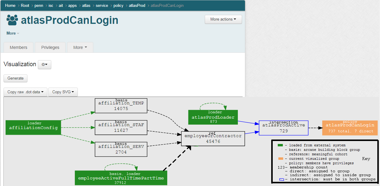
I think these are all great ideas. I actually neglected to test the case of simple group loaders. I'm quite relieved that the arrow does the right thing and points to itself. However, it's a bug that they don't display membership counts, as I assumed they wouldn't have members. The line color for membership should also not be green.
Maybe the legend can go into a help popup or a hover label? It should be able to read the same properties as the graph to get the color scheme, so it will match.
-Chad
From: [mailto:]
On Behalf Of Hyzer, Chris
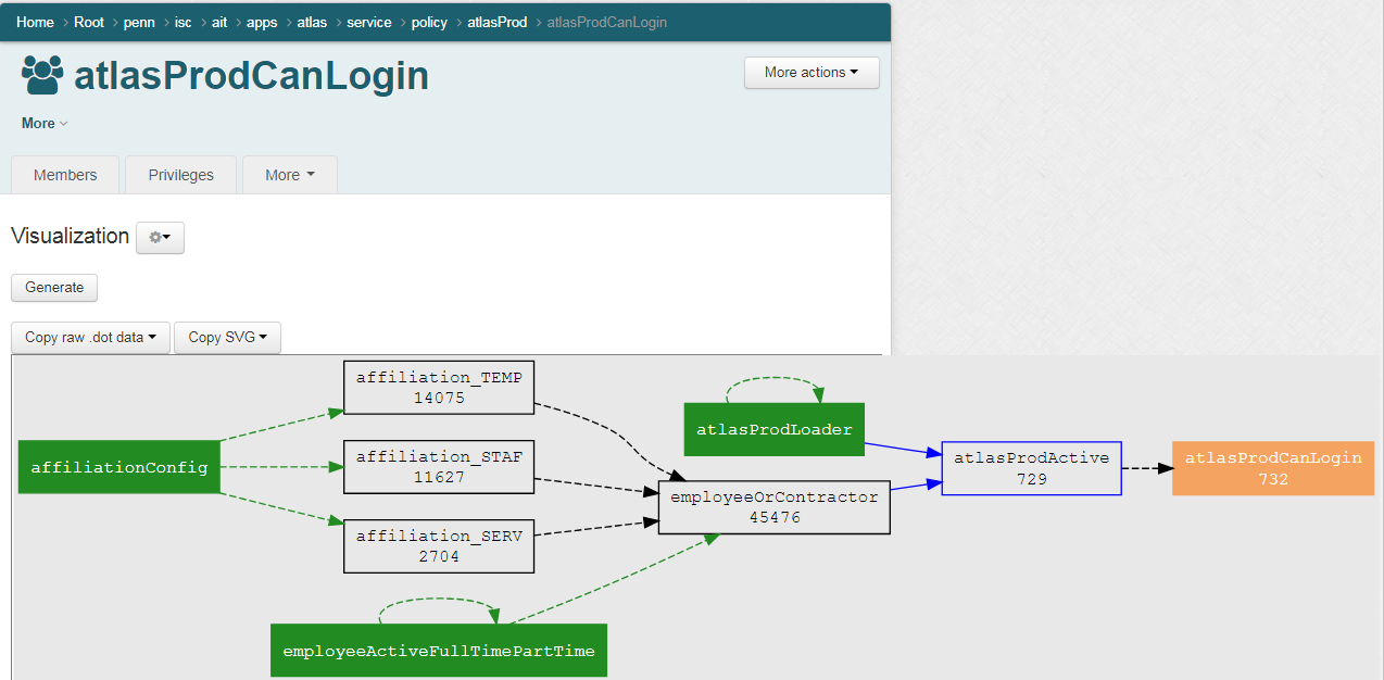
Here is a real world example… I was asked to explain an app policy for being able to log in… I included a marked up version below which might spark some ideas/conversation? 😊
I pulled up the visualization. This is not a complex policy, but seeing the picture helped a lot.
From left to right…
Summary, no one without an account or who doesn’t work at penn can access the app. The entire app is reverse proxied from apache which is entirely protected by shib so unauthorized entities also cant try to hack at the underlying server either.
I think this pic describes the policy so I am very happy with it… keep reading below…
I have to start off by saying I feel guilty having suggestions here since it is already so great. But… cant help it 😊
I marked up this view with some ideas. Note, if there is too much going on, things can be toggled in the preferences… Also note: I didn’t have space to fit things in, so imagine better spacing, and consistent fonts etc… and yes, I changed the numbers a tad, not important…
And so you don’t have to play the game where you have to see whats different:
Thoughts? 😊
Thanks, Chris
From: Hyzer, Chris
The whole Grouper team has been releasing a lot of compelling patches lately, but this one is particularly exciting.
Michael Gettes and Nick Ivanov had the simultaneous independent idea for this, and each implemented a proof of concept. Grouper developer Chad Redman took what they did (parts of each POC) and added a lot of features, and incorporated this into Grouper. Thanks to all three of you!
In the latest Grouper patches, and soon to be a grouper package, you can see graphically how a Group, Folder, or Entity is used in grouper. This will show end users how a group is constructed (e.g. the policy), where a groups is used (e.g. if changes are needed), or how a folder is organized (we know it can get confusing).
This is on the demo server if you want to kick the tires. Or install the patches or get the container. Please give us any feedback as we plan to iterate on this soon.
Here are some examples:
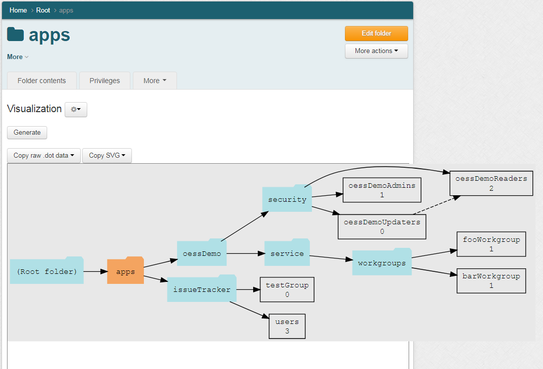
How a folder is organized: (note, the objects are clickable to focus on a different location!) Note, the numbers on the groups are the member count
Here is how a group is used and constructed
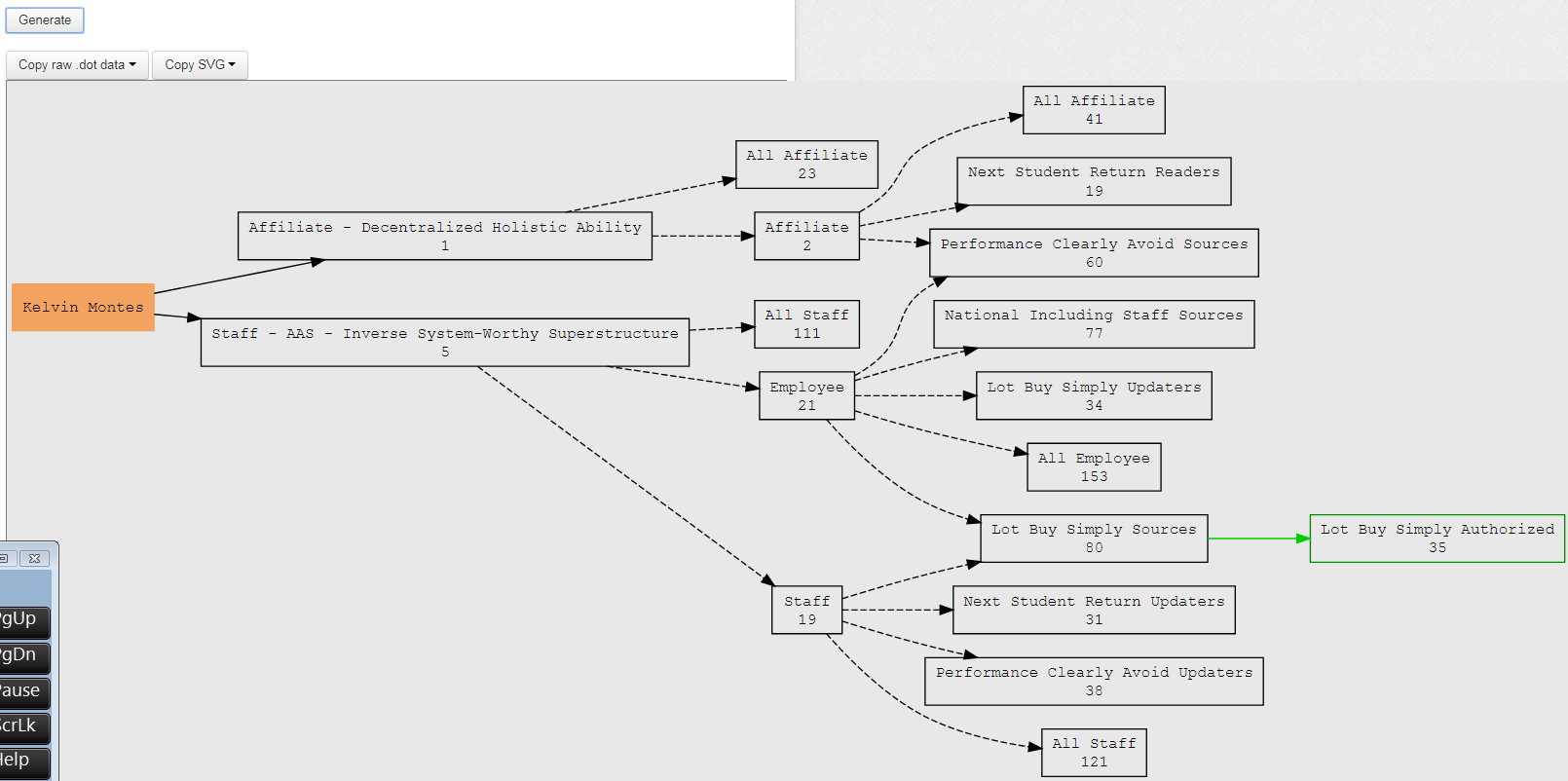
Here is how a user is visualized
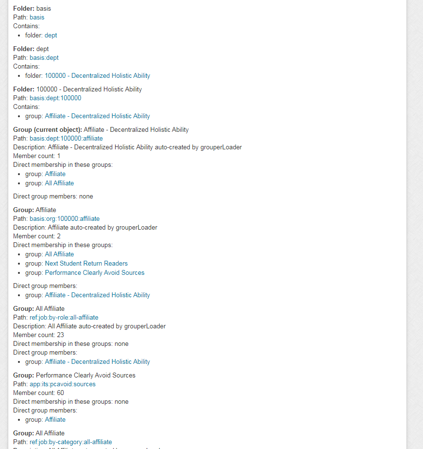
There is also a text version of this analysis, for accessibility or other reasons
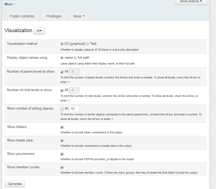
Here are some configurations:
Thanks again for the hard work of Chad, Michael, and Nick, and the speedy collaboration that took place. Chris
Ps. patches:
grouper_v2_4_0_api_patch_28 grouper_v2_4_0_api_patch_29 grouper_v2_4_0_ui_patch_12 grouper_v2_4_0_ui_patch_13
Jira: https://bugs.internet2.edu/jira/browse/GRP-1966 Wiki: https://spaces.at.internet2.edu/display/Grouper/Visualization+UI https://spaces.at.internet2.edu/display/Grouper/Grouper+Visualization+API
|
- RE: [grouper-users] grouper ui visualization patches!, Hyzer, Chris, 03/22/2019
- RE: [grouper-users] grouper ui visualization patches!, Redman, Chad, 03/22/2019
- RE: [grouper-users] grouper ui visualization patches!, Black, Carey M., 03/22/2019
- RE: [grouper-users] grouper ui visualization patches!, Redman, Chad, 03/22/2019
Archive powered by MHonArc 2.6.19.
