comanage-dev - Re: [comanage-dev] Re: [JIRA] (CO-1102) Move sidebar searches on co_people and org_identities below abc search
Subject: COmanage Developers List
List archive
Re: [comanage-dev] Re: [JIRA] (CO-1102) Move sidebar searches on co_people and org_identities below abc search
Chronological Thread
- From: Arlen Johnson <>
- To:
- Subject: Re: [comanage-dev] Re: [JIRA] (CO-1102) Move sidebar searches on co_people and org_identities below abc search
- Date: Tue, 28 Jul 2015 12:56:50 -0400
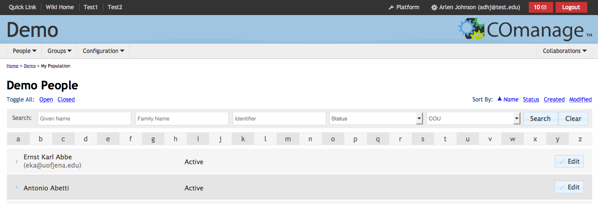
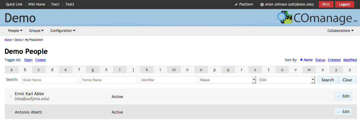
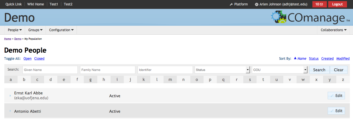
On 7/27/15 10:42 PM, Benn Oshrin wrote:Sure - how about something like this:The search bar could use a little visual separation... perhaps move it above the alphabet? Or box it up?  Here's the original for comparison. I ended up choosing this over the former because it was unobtrusive and took up the least room. But I like the former just as well.  And here's one with a touch of color if you really want to make the search stand out. I don't much like the color, but you get the idea. In this case, I've also connected the alpha menu to the search since they are somewhat related (and "clear" impacts them as well). :  And here's the first choice with A-Z connected, a bit more padding, etc:  Take a pick. (-: Also, there's now no sidebar for CO People, but there is one for Org Identities. Let's be consistent. Note while CO People >> Enroll is available in the menu bar, there's no equivalent for Org Identities. I'd be inclined to ditch the sidebar (it's wastes a lot of space) but put an "(+) Enroll" or "(+) Add" button somewhere on the top of the page (sort of like the mobile sized responsive sidebar). I completely agree. I almost did this prior to pushing my changes, but decided to hold off until after. I'm happy you have the same take on it. The Status and COU labels on the popups are a bit confusing, since when you pop up the menu they look like valid options rather than default labels. Maybe add a "(pick one)" or "(select)" note? Agreed. I originally made them vanish from the menu altogether, but doing so makes it difficult to reset the one field without clicking "clear" (which resets all of them). I'll add the note for the "empty" element (and keep it italicized). Overall, though, I like this change. Great! Arlen |
- [comanage-dev] Re: [JIRA] (CO-1102) Move sidebar searches on co_people and org_identities below abc search, Benn Oshrin, 07/28/2015
- Re: [comanage-dev] Re: [JIRA] (CO-1102) Move sidebar searches on co_people and org_identities below abc search, Arlen Johnson, 07/28/2015
Archive powered by MHonArc 2.6.16.