I'm making progress on the co_people views ... and will likely
commit changes today or tomorrow. After these updates, I plan to
wrap up the menu changes.
I have a few questions about the co_people pages. I've included
some screenshots for illustration. Please note that most of these
pages have not passed through final polish (some of which depends on
answers to the following questions). I apologize in advance for
being long-winded. (-:
- Compare / View:
- view.ctp is referred to as "compare" from the co_people
index. It is called "view" on the page. Is it intended to
serve both purposes? If so, I suggest the following:
- refer to this view (in navigation) as "View". On the view
page, stack the listings vertically. Then, provide a
checkbox (or button) that will allow a side-by-side
comparison such as currently exists. This will allow the
end-user to pick the layout as they wish, and it make this
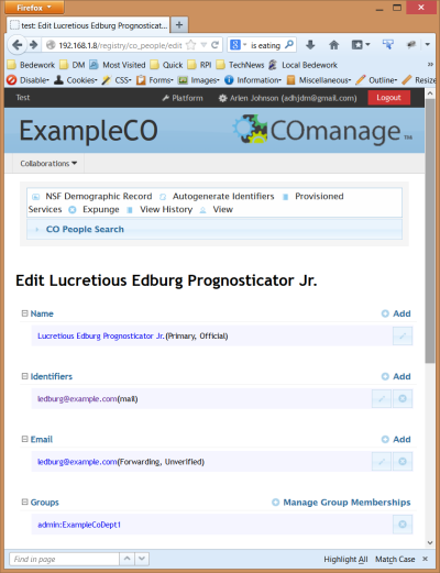
layout more consistent with the "edit" view.
In other words, we can allow the user to toggle between this
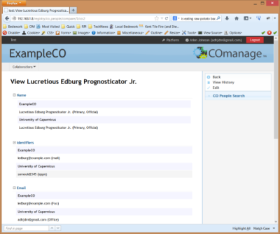
(vertical stack):

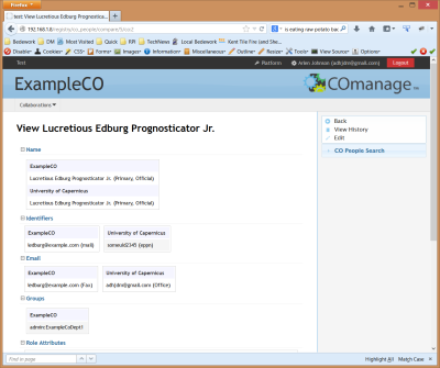
and this (side-by-side):

(note that the names do not float side-by-side like the
other fields do. Should they?)
- When editing subsections of a person (roles, identifiers,
org ids, etc), there is no navigation to return to where we
were previously. This could take the form of a "back" button,
a sidebar menu, or breadcrumbs. Are there reasons this should
not be pursued (in other words, is there some reason that
knowing where to go back to is a big issue), and do you have a
preference? We'll want to implement breadcrumbs regardless,
but I think using the sidebar consistently as a means of
navigation is good. I'm leaning towards implementing it in
these subsections.
- With regard to the sidebar: I have begun to implement some
rudimentary responsive features to allow for better viewing on
desktops at different sizes and on tablets. In the wider modes,
like the screenshots above, we get the sidebar. On tablet
portrait or phone, the sidebar moves to the top, like so:

Not much attention has been given to smartphones, and I suggest
that any real attention can wait until after 1.0.
- With regard to the "subsections" such as organizational
identity: I intend to keep the tabbed view intact - largely to
distinguish these modes from the more global "edit" and
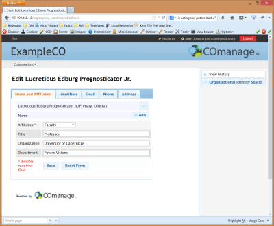
"view/compare" modes. I've done some minor clean-up on these
views to tighten up the styles. For example:

This screenshot is a good example where a link in the sidebar
could take us back to where we were.
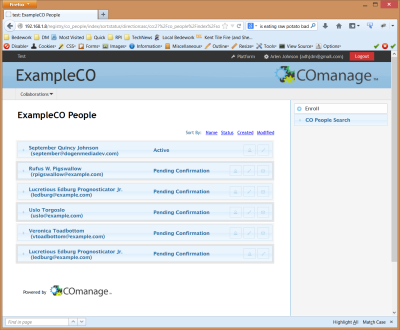
- co_people index:
- The co_people index is built as a stack of accordion
widgets. As of now, the accordion opens to reveal user
roles. Is this as you want it? Are there more pieces of
information that would be valuable here, or is this pretty
close to right?
- A good deal more clean up is coming to the people index; at
the moment, it still looks fairly close to the original:

I've removed rounded edges on most items (you'll note that
even the "logout" button is no longer rounded, Benn ;-) - but
I'll probably also scale back the "glassy" UI look from this
listing. If you are looking for more radical changes, now is
a good time to suggest them.
That's about it for now. Some other quick notes:
- A spinner appears on submit of any form:

- As noted at the top, the menus are not finished, but I expect
that to be reasonably low-hanging fruit. I'll add the
"Collaborations" pull down menu next to the person menu in the
black bar for selecting the CO. Then the submenu will appear on
the gray bar (where "Collaborations" is now).
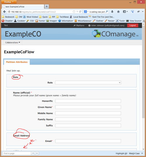
- I took some liberty with the "enroll" form, with the goal of
cleaning and simplifying the layout. I note that there are
blocks where the field titles are redundant - e.g. Role, Email
Address, Affiliation (perhaps others). In these cases, are you
comfortable not showing these titles and instead let the field
titles stand alone?

- Where possible, I've been stripping out inline styles (e.g.
style="float:left;width:100%") in favor of applying a class to
the markup. This is cleaner and more flexible method of styling
the pages.
I welcome your feedback (even if it's just "green light: move
ahead" or "red light: hold up").
Best wishes -
Arlen
p.s. I plan on closing tickets at the point a pull has taken
place to get my branched code into the main project. If you want
me to take a different approach, please let me know.
|
